Mediaqueries in Javascript
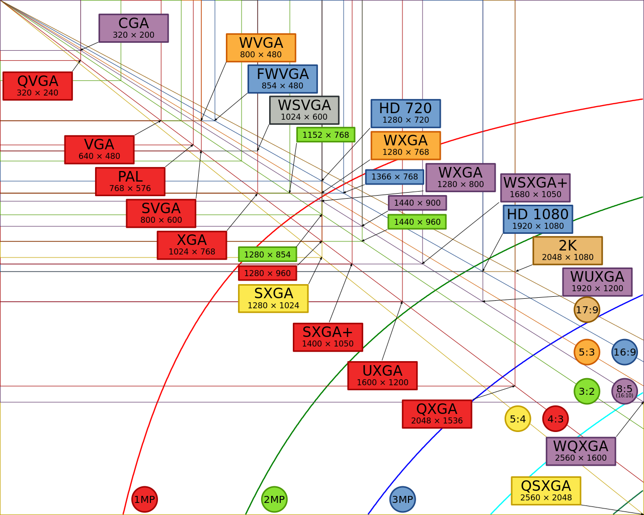
all those diffent screeeeennnssss.....!!
When building a responsive front-end for your webpage the use of css mediaqueries is inevitable, as you know.
Using
1 2 3 4 5 | @media screen and (max-width: 992px) { #widths{ background-color: yellow; } } |
Will make the background of the #widths-element yellow on screens that are less wide than 992px. This works nicely and is crossbrowser reliable.
Sometimes however you will also want to trigger some javascript at that same point. This is less standardized. There are several methods to determine the width of the available space. An important question is: What measures the available width? Is it the width of your screen? or the width of the html-element? The viewport? What is the viewport anyway..? Should you use window.innerWidth? screen.width? clientWidth?
The viewport
The viewport (in the context of web) is the area of your browserwindow that is visible. It's dimension determine the available space for your html-element, which usually takes up 100% of the viewport. Or does it? This is quite well explained in these two articles
In order to see for ourselfs what method does what and what is most reliable, I have put together the following demo.
What you see is some of the common methods used to measure the size of the window in order to use that value to trigger something (e.g. a new layout).
Initially you'll see that, except for window.screen.width the values for the other methods are the same.
- window.screen.width x height: x
this is static, is it simply the size of the screen and therefor not very usefull for webdevelopment. - window.innerWidth x height: x
- document.documentElement.clientWidth x height: x
- document.documentElement.offsetWidth x height: x
- $(window).width() x height(): x
- window.matchMedia("(max-width: 992px)").matches
However if we add a little (very unusual) margin to the html-element we start to see diffenrences in the returned values.
Depending on your needs, this can be crucial. In our case, we want to sync our css mediaqueries to a trigger in js.
So if you scale this browser window, both with and without the extra margin on the html you'll see that - in case it is supported in you browser - window.innerWidth is the correct value which corresponds with the set mediaquery (the one shown above). So it would make sence to use that as a trigger value for your js-functions.
This works fine, yet it feels a little hacky. Especially when detecting things like 'orientation' or 'device-aspect-ratio'. Using the available numbers you need to do all sort of calculations to trigger these situations.
Luckily there is something better: window.matchMedia().
Window matchMedia() Method
The best javascript equivalent to CSS mediaqueries is window.matchMedia. It is supported by all modern browsers. It is however a 'working draft'. The future of this is uncertain.
But there is also a polyfill.
It is always good to check if it is available:
1 2 3 | if(window.matchMedia){ //jay! now we can matchMedia. } |
1 2 3 4 5 6 7 | if (window.matchMedia("(max-width: 992px)").matches) { /* The viewport is less than, or equal to, 992 pixels wide */ document.getElementById("matchmedia-result").innerHTML = "smaller or equal to 992px" ; } else { /* The viewport is greater than 992 pixels wide */ document.getElementById("matchmedia-result").innerHTML = "bigger than 992px" ; } |
As said an advantage over window.innerWidth/Height is that you can actually use values like 'orientation: landscape', without the need to calculate it.
If you would like to use all this in a more advanced and organized manner, there is
Enquire.js to handle your javascript mediaqueries.